您现在的位置是:网站首页> 编程资料编程资料
CSS3+JavaScript实现炫酷呼吸效果的示例代码使用CSS媒体查询(Media Queries)和JavaScript判断浏览器设备类型的方法使用html5+css3来实现slider切换效果告别javascript+css
 2021-09-03
1163人已围观
2021-09-03
1163人已围观
简介 这篇文章主要介绍了CSS3+JavaScript实现炫酷呼吸效果的示例代码,文中通过示例代码介绍的非常详细,对大家的学习或者工作具有一定的参考学习价值,需要的朋友们下面随着小编来一起学习学习吧
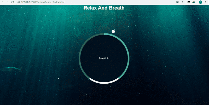
用css3动画实现的一个简单炫酷效果,最终的效果图如下:
页面结构(index.html):
Document Relax And Breath
script.js:
const container = document.querySelector('.container'); const text = document.querySelector('#text'); const totalTime = 7500; const breathTime = (totalTime/5)*2; //呼吸的时间为3s const holdTime = totalTime/5; //保持呼吸的时间为1.5s console.log(breathTime); breathAnimation(); //一开始自执行breathAnimation函数 function breathAnimation(){ text.innerHTML = 'Breath In'; container.className = 'container grow'; //给container添加grow类,实现放大效果 setTimeout(function(){ text.innerHTML = 'Hold On'; setTimeout(function(){ text.innerHTML = 'Breath Out'; container.className = 'container shrink';//给container添加shrink类,实现缩小效果 },holdTime) },breathTime) } setInterval(breathAnimation,totalTime); //重复执行样式(style.css):
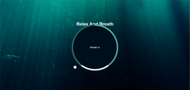
*{ margin: 0; padding: 0; box-sizing: border-box; } body{ background: url('./img/bg.jpg') no-repeat center center /cover; min-height: 100vh; font-family: Arial, Helvetica, sans-serif; color: #fff; overflow: hidden; display: flex; flex-direction: column; align-items: center; justify-content: center; } /*注意设置margin为auto*/ .container{ position: relative; width: 300px; height: 300px; display: flex; align-items: center; justify-content: center; transform: scale(1); margin: auto; } /*使用圆锥渐变作为背景,宽高比.container稍大,同时z-index要设为-2,因为还有一层为.circle,最外层是文字*/ .gradient-circle{ position: absolute; left: -10px; top: -10px; background: conic-gradient( #55b7a4 0%, #4ca493 40%, #fff 40%, #fff 60%, #336d62 60%, #2a5b52 100% ); width: 320px; height: 320px; border-radius: 50%; z-index: -2; } /z-index为-1,为中间黑色的圆/ .circle{ position: absolute; left: 0; top: 0; width: 300px; height: 300px; background-color: #010f1c; border-radius: 50%; z-index: -1; } /*.pointer-container是小球外面的容器,其高设置为190,是因为其中150为半径,还有40为top-40,这样就会绕着圆心转,且不会换到里面来,注意transform-origin为中下方*/ .pointer-container{ position: absolute; width: 20px; height: 190px; top: -40px; left: 140px; /* background-color: red; */ transform-origin: bottom center; animation: rotate 7.5s linear forwards infinite; } /*小球*/ .pointer{ width: 20px; height: 20px; background-color: #fff; border-radius: 50%; } /*设置小球转圈的效果*/ @keyframes rotate{ from{ transform: rotate(0deg); }to{ transform: rotate(360deg); } } .container.grow{ animation: grow 3s linear forwards; } .container.shrink{ animation: shrink 2s linear forwards; } @keyframes grow{ from{ transform: scale(1) }to{ transform: scale(1.2); } } @keyframes shrink{ from{ transform: scale(1.2) }to{ transform: scale(1); } }如果.container的margin不设置为auto或者一个具体的值,就会造成下图的效果,文字和圆挤在一块:
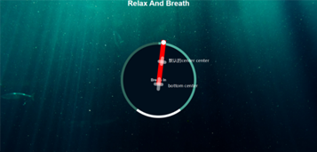
同时我把.pointer-container里面的 background-color: red; 添上就会更加理解为什么要把.pointer-container的高度设置为190px.另外如果不把transform-origin设置为bottom center它就会如图中标注的默认点旋转,这并不是我们想要的效果.
还有个细节就是.shrink的动画时间我设置成了两秒,其实按照js里面的breath out这段时间应该为3s,但是为了从breath out到breath in有个缓冲的效果,就设置成了2s,不然breath out到breath in没有一个过渡,会显得突兀不好看.
到此这篇关于CSS3+JavaScript实现炫酷呼吸效果的示例代码的文章就介绍到这了,更多相关CSS3+JavaScript呼吸效果内容请搜索以前的文章或继续浏览下面的相关文章,希望大家以后多多支持!
相关内容
- 纯CSS实现左右拖拽改变布局大小纯 CSS 实现拖拽效果的代码
- div自适应高度自动填充剩余高度div不能自适应高度不能随图片的高度变化拥有最小高度能自适应高度同时全兼容IE、FF的div设置子元素div高度不确定时父div高度如何自适应相邻div实现一个跟着另一个自适应高度示例代码怎样让一个div高度自适应浏览器高度CSS min-height IE6、IE7、FF下DIV自适应高度
- CSS让子容器超出父元素(子容器悬浮在父容器效果)css使用flexbox布局容器内多元素水平居中Css浮动元素外层容器高度为0(无高度)的解决方法CSS常见的让元素水平居中显示的方法清除网页浮动CSS的做法CSS教程:彻底弄懂闭合浮动元素
- css3实现小箭头各种图形效果css3中transform属性实现的4种功能详解CSS3.0(Cascading Style Sheet) 层叠级联样式表纯CSS3实现div按照顺序出入效果CSS3实现列表无限滚动/轮播效果css3 利用transform-origin 实现圆点分布在大圆上布局及旋转特效CSS3实现的侧滑菜单CSS3实现的3D隧道效果用CSS3画一个爱心css3 实现文字闪烁效果的三种方式示例代码六种css3实现的边框过渡效果
- 奇妙的 CSS 属性 MASK详解css中filter属性和backdrop-filter的应用与区别详解详解HTML5中CSS外观属性CSS中简写属性要注意TRouBLe的顺序问题(避免踩坑)CSS字体、文本、列表属性详细介绍CSS 继承 inherit属性的方法利用CSS中的 outline-offset 属性实现加号css一些不常见但很有用的属性操作大全
- 使用CSS cross-fade()实现背景图像半透明效果的示例代码
- 解决CSS样式冲突的几个办法(小结)css样式冲突问题练习示例
- CSS 中使用径向渐变实现卡券效果CSS Transition通过改变Height实现展开收起元素从QQtabBar看css命名规范BEM的详细介绍css实现两栏布局,左侧固定宽,右侧自适应的多种方法CSS 实现Chrome标签栏的技巧CSS实现两列布局的N种方法CSS实现隐藏搜索框功能(动画正反向序列)CSS3中Animation实现简单的手指点击动画的示例详解CSS中的特指度和层叠问题详解overflow:hidden的作用(溢出隐藏、清除浮动、解决外边距塌陷)关于CSS浮动与取消浮动的问题
- CSS3里box-shadow属性的使用方法示例详解CSS3 box-shadow属性实例详解CSS3阴影效果样式库box-shadows.css 53种css3 box-shadow阴影(外阴影与外发光)图示讲解详解CSS3阴影 box-shadow的使用和技巧总结 CSS3实现多重边框的方法总结详解CSS3的box-shadow属性制作边框阴影效果的方法
- CSS垂直居中的另类实现代码详解(不走寻常路)CSS3 不定高宽垂直水平居中的几种方式利用css样式实现表格中字体垂直居中的方法CSS3实现水平居中、垂直居中、水平垂直居中的实例代码手把手教你CSS水平、垂直居中的10种方式(小结)css常用元素水平垂直居中方案css布局教程之如何实现垂直居中CSS实现垂直居中的几种方法小结